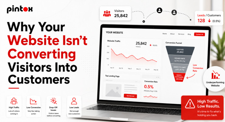
Most websites do not fail because of “bad design.” They fail because visitors feel confused or unsure. That creates a negative experience and lost leads.
In 2026, expectations are higher than ever. People judge your business in seconds. They decide if you seem credible, fast, and helpful.
This guide covers the most common website mistakes. You will also get clear fixes for each one. The goal is simple: more calls, bookings, and form fills. That starts with the Basics of Web Design, not flashy effects.
Quick Takeaways (Fix These First)
If you want fast wins, start here. These changes often lift conversion rate quickly.
Fast wins that usually matter most:
- Fix slow load times and improve website speed.
- Add a clear call to action above the fold.
- Simplify website navigation for better user guidance.
- Improve brand trust with testimonials and proof.
- Add lead capture and a follow-up system.
Want a second opinion on your site? Send your homepage and goal, and get three quick fixes.
Why Most Website Design Mistakes Cost Leads in 2026
User journeys are more impatient now. Most traffic is mobile, and attention is shorter. Mobile users’ behavior rewards clarity and speed.
People also trust fewer businesses online. They look for signals of website credibility. They want proof before they click.
If your site feels confusing, visitors bounce. That bounce rate often signals poor user experience. It can also reduce SEO performance over time.
Web Design Mistakes Checklist (2026 Priority Table)
Mistake | What it breaks | How to spot it fast | Fast fix | Pro fix |
| Slow load times | Trust, SEO, conversion rate | Page feels heavy on mobile | Compress images | Improve hosting and caching |
Confusing website navigation | User guidance, user journeys | People scroll without clicking | Simplify menus | Redesign information architecture |
| Missing call to action | Lead capture, conversion rate | No obvious next step | Add one primary CTA | Rewrite page flow and CTAs |
Poor mobile layout | Website usability | Buttons are hard to tap | Fix spacing and font | Mobile-first rebuild |
| Overwhelming design | Clarity and focus | Too many blocks and colors | Reduce sections | Build a clean layout system |
Intrusive pop-ups | Brand trust | Users close the page quickly | Delay or remove | Replace with smart intent offers |
| Boring content | Engagement | Generic copy everywhere | Add outcomes and proof | Rewrite messaging and pages |
Outdated website design | Credibility | Looks old or broken | Refresh visuals | Modern website design update |
| Weak layout | Professional web layout | Misaligned sections | Use a grid | Full professional web page design |
No follow-up system | Revenue | Leads go silent | Add auto replies | Add email marketing automation |
These are not just design issues. They are conversion rate mistakes that leak revenue. That is why the Web Design Benefits matter in real numbers, not opinions.
10 Website Mistakes to Avoid in 2026 (With Fixes)
Below are ten website mistakes to avoid. They also match many website design mistakes that rank well in search. Use the fixes even if you do not rebuild.
1: Slow Load Times That Make People Leave
Slow load times feel like poor service. They also hurt website credibility. Many visitors never wait.
How to spot it fast:
- Your site loads slowly on mobile data.
- Images take time to appear.
- Pages feel “stuck” when scrolling.
Why it hurts:
- It creates a negative experience.
- It reduces leads and sales.
- It can weaken SEO rankings.
Fast fix:
- Compress images and remove heavy videos.
- Cut the extra scripts you do not need.
Pro fix:
- Move to a faster web host.
- Add caching and performance tuning.
2: Poor Navigation That Breaks User Guidance
People should know where to go next. Poor navigation forces them to guess. That kills website usability.
How to spot it fast:
- Users do not reach key pages.
- Visitors keep bouncing back and forth.
- The menu has too many items.
Why it hurts:
- It damages user journeys.
- It lowers the conversion rate.
- It can increase bounce rate.
Fast fix:
- Keep menu items limited and clear.
- Use simple labels, not cute names.
Pro fix:
- Improve landing page navigation by intent.
- Map the user path from entry to action.
3: Missing Call to Action That Stops Conversions
This is the silent killer. Many sites look nice, but do nothing. They have a missing call to action.
How to spot it fast:
- No primary button above the fold.
- CTAs vary across pages.
- Visitors scroll but never act.
Why it hurts:
- People need clear direction.
- Without it, lead capture drops.
- Your conversion rate stays flat.
Fast fix:
- Add one primary call to action.
- Make it specific and benefit-driven.
Pro fix:
- Align CTAs with user intent by page.
- Build one conversion path per page.
Book a free discovery call to map your top three fixes.
4: Layout That Ignores Mobile Users’ Behavior
Mobile is not a smaller desktop. It needs different design choices. Ignoring this causes usability issues in website design.
How to spot it fast:
- Text is tiny on phones.
- Buttons are close together.
- Pop-ups cover the screen.
Why it hurts:
- It creates a poor user experience.
- It breaks user guidance on small screens.
- Users leave and do not return.
Fast fix:
- Increase font sizes and spacing.
- Make buttons easy to tap.
Pro fix:
- Redesign key pages with mobile-first thinking.
- Test real mobile user journeys.
5: Overwhelming Design That Hides the Offer
More design is not better design. Too many sections create noise. Overwhelming design makes people quit.
How to spot it fast:
- Too many colors on one page.
- Too many visual elements are competing.
- No clear next step.
Why it hurts:
- It reduces clarity and focus.
- It weakens brand trust.
- It lowers the conversion rate.
Fast fix:
- Use one clean color palette.
- Remove extra sections from the homepage.
Pro fix:
- Build a consistent layout system.
- Create one message per section.
6: Pop-ups That Interrupt Instead of Helping
Pop-ups can work when used carefully. Most sites use them too aggressively. That causes a negative experience.
How to spot it fast:
- Pop-ups appear on page load.
- They block content on mobile.
- Users close them without reading.
Why it hurts:
- It damages website credibility.
- It feels pushy and spammy.
- It lowers engagement and leads.
Fast fix:
- Delay pop-ups or remove them.
- Use them only on exit intent.
Pro fix:
- Offer a helpful lead capture option.
- Match the offer to the page topic.
7: Boring Content That Does Not Build Trust
Design cannot save weak messaging. Boring content makes you look like everyone else. That is a trust problem.
How to spot it fast:
- Copy sounds generic and vague.
- No proof or specifics.
- No clear benefits.
Why it hurts:
- People do not feel safe choosing you.
- Brand trust stays low.
- They look for better options.
Fast fix:
- Add specific outcomes and examples.
- Add testimonials near key CTAs.
Pro fix:
- Rewrite your pages around client pain points.
- Use proof to build trust in every section.
Mistake #8: Outdated Website Design That Signals “Not Active”
An outdated website design makes visitors worry. They wonder if your business is still active. That hurts website credibility.
How to spot it fast:
- Old fonts and cramped layouts.
- Stock photos everywhere.
- Pages look broken on mobile.
Why it hurts:
- It reduces the perception of professional web designs.
- It lowers trust signals.
- It can reduce conversions.
Fast fix:
- Refresh typography and spacing.
- Update images and page sections.
Pro fix:
- Plan a modern website design refresh.
- Improve structure, visuals, and clarity together.
9: Poor Website Design Layout That Looks Unprofessional
Poor website design can look “cheap.” That is not about taste. It is about confidence and trust.
How to spot it fast:
- Misaligned sections and uneven spacing.
- Inconsistent buttons and headers.
- Hard-to-scan pages.
Why it hurts:
- It weakens a professional web layout.
- It reduces perceived quality.
- It lowers lead capture.
Fast fix:
- Use a simple grid and consistent spacing.
- Limit fonts and button styles.
Pro fix:
- Upgrade to professional web page design standards.
- Create consistent templates for key pages.
10: No Follow-Up System After the Form Fill
Most leads need quick follow-up. Without it, leads go cold. This is one of the biggest conversion rate mistakes.
How to spot it fast:
- Form fills do not get replies quickly.
- Calls go to voicemail with no backup.
- Leads stop responding.
Why it hurts:
- It wastes ad spend and SEO leads.
- It lowers the conversion rate.
- It limits growth.
Fast fix:
- Add instant email confirmation.
- Add a simple follow-up system.
Pro fix:
- Add email marketing automation and SMS updates.
- The route leads to the right person quickly.
How to Fix Common Website Mistakes Without Rebuilding Everything
You do not always need a full redesign. Many common website mistakes have quick fixes. Start with the highest-impact items. Use Web Design Trends only when they support clarity, speed, and conversions.
DIY fixes you can do in one afternoon:
- Add one clear call to action per page.
- Improve website navigation and menu labels.
- Add testimonials near your main CTA.
- Cut clutter and improve clear direction.
Fixes worth outsourcing:
- Speed work that improves website speed.
- Usability testing for real user journeys.
- The conversion path works for lead capture.
What “Professional Web Designs” Actually Include in 2026
“Professional” is not just a nice homepage. It is a system that guides visitors. It also removes friction at every step.
Professional web layout that supports conversions
A professional web layout is easy to scan. It has a clear hierarchy and spacing. It makes actions feel obvious.
It also supports conversion rate goals. Buttons appear where people expect. Forms feel simple and safe.
Professional web page design that supports SEO and trust
Professional web page design supports clarity and structure. It helps search engines understand your pages. It also supports website credibility.
Turn Your Site Into a Lead Capture Engine
A website should produce leads, not confusion. The goal is simple user guidance. Make the next step obvious.
The simplest lead capture flow for USA SMBs
Use one primary offer per page. Examples include quotes, bookings, or consultations. Keep forms short and clear.
Lead capture basics that work well:
- One strong headline and benefit.
- One primary call-to-action button.
- One short form or booking option.
- Proof near the form, like testimonials.
Add automation so leads do not go cold
Speed matters after the click.
Follow-up should be immediate and helpful.
That is where email marketing automation helps.
Simple automation that improves conversion rate:
- Instant email confirmation.
- SMS reply for missed calls.
- A short follow-up sequence.
- Lead routing by service or location.
FAQ – Web Design Mistakes (SEO + UX)
How do web design mistakes affect user experience?
They create confusion and friction. Visitors cannot find what they need. That leads to frustration and exits.
Why do poor web design choices increase bounce rate?
People leave when pages feel slow or unclear. Poor user experience makes visitors lose trust. They also abandon confusing user journeys.
What web design mistakes hurt SEO rankings the most?
Slow load times and weak structure hurt SEO. Poor navigation can reduce crawlability. Thin content also limits relevance.
How does slow website speed impact web design performance?
Slow pages reduce engagement and conversions. They also damage website credibility fast. Many users never return after one slow visit.
Why is poor navigation considered a major web design mistake?
Navigation is your roadmap. Bad routes create lost users and wasted visits. Clear website navigation improves website usability.
How does a lack of mobile responsiveness affect websites?
It breaks mobile user journeys. Buttons become hard to use. That causes usability issues in website design.
Get a Fast Website Mistake Audit
If your site is not producing leads, do not guess. Most fixes are simple once you see them. You just need a clear plan.
You will learn what is blocking your conversion rate. You will also get a priority list you can act on. That is how you avoid the website mistakes to avoid in 2026.
Pintox Digital provides web design and development services that turn those fixes into real results.