Your site might be attracting visitors. Your SEO and ads could be doing well, too.
But if people hit your page and bail without submitting the contact form, there’s a glitch in your conversion process.
Many businesses fixate on drawing in more visitors but overlook what occurs post-arrival. The truth is, a contact form design not up to the level could secretly be costing you leads daily.
People might want to buy your stuff or sign up right away. But if the form looks too complex or long, they get bored and just go somewhere else instead.
That possible customer vanishes. This leaves you with reduced inquiries, poorer conversion rates, and less revenue.
In this guide, we’ll look at the typical reasons why people dodge those contact forms, show some practical design upgrades to boost submissions, and explain how businesses can quit letting good opportunities slip away due to a lackluster user experience and inadequate website planning.
Your Contact Form Is More Important Than You Think
Many companies barely think about their website contact forms. They just add a few fields, put a submit button below, and boom, it’s live. The issue is that the contact form is usually the last thing visitors see before becoming leads.
Think about it.
Someone might spend lots of time on your site, reading stuff, checking out services, and looking at testimonials. But when they want to reach out, if the form is a hassle, guess what? They’re leaving.
So, contact form design isn’t just about gathering info. It’s about making it super easy for interested people to actually get in touch.
The Biggest Reason Visitors Ignore Your Form
The most common problem is simple.
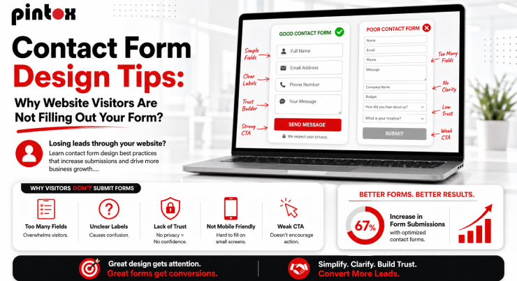
You are asking for too much information.
Many businesses try to gather extensive details before a conversation even begins. Instead of requesting a name and email address, they ask for:
- Full name
- Phone number
- Company name
- Business size
- Industry
- Budget
- Project timeline
- Address
- Preferred contact method
- Additional questions
To visitors, this feels like work. The longer the form length, the higher the likelihood of form abandonment. People often arrive with a simple question. They do not want to complete a mini application process.
A good contact form design focuses on starting conversations, not conducting interviews.
Your Visitors Are Afraid of Being Sold To
Consumers have gotten much warier online. Now, when people come across a contact us form on a website, they often worry:
- “Will I receive endless sales emails?”
- “Will my phone start ringing every day?”
- “Will my information be shared with other companies?”
All these worries hold people back from filling out forms. Adding a quick, reassuring line right by the submit button can build their confidence.
Like, saying something simple, such as:
“We respect your privacy and never share your info.”
It helps ease their minds and boosts the number of completed forms. In truth, building trust should be a bigger priority in designing these things.
Bad User Experience Creates Immediate Friction
Visitors make quick decisions.
If a form looks cluttered or confusing, many just leave without trying to finish it.
So, good web design elements become really important.
An intuitive layout helps users figure out what info is needed, without overthinking.
Usually, the best forms have a simple one-column structure, clear labels, sensible spacing, and obvious instructions.
A visitor should instantly know:
- What information is required
- How long will the form take
- What happens after submission
When users feel comfortable, submission rates increase.
Mobile Users Are Often Ignored
Over half of website traffic is now from mobile devices, yet a lot of companies still mainly design forms for desktops.
A contact form on website pages should be tested thoroughly on phones and tablets.
Imagine attempting to fill out a form with teeny tiny fields and awkward dropdown menus that barely show up on your phone.
Most users would just leave the site.
It’s way better to have mobile-friendly forms with big fields, easy-to-hit buttons, and less need for typing. Generally, shorter forms work much better on mobile devices.
Common Web Design Mistakes That Hurt Form Conversions
Many businesses accidentally make similar blunders, thinking they’re small potatoes, yet end up being dealbreakers for users.
- Too many mandatory fields irritate visitors. Nobody wants to provide unnecessary information. So keep those required boxes to a minimum.
- Vague error handling drives people frustrated, especially when all you get is a fuzzy error message after wasting your time filling the form. It’d be ace to have clear directions right away, to help users fix hiccups instantly.
- Many forms still use generic buttons like “Submit”. Replace it with some effective and action-focused ones, such as “Get My Quote,” “Schedule a Consultation,” “Request Pricing,” or “Speak With Our Team.”
These are some of the most common web design mistakes that reduce form submissions.
Why Visitors Leave Before Finishing
Form abandonment happens for several reasons beyond form length.
Sometimes visitors simply become distracted.
Other times, they encounter technical issues.
In many cases, they do not understand why certain information is being requested. This is where helper text can improve the experience. For example, if you ask for a phone number, explain why:
“We may call only if additional project details are required.”
Context removes uncertainty.
A strong contact form design anticipates user concerns before they arise.
The Hidden Cost of Lost Leads
Every abandoned form means lost cash. With 1,000 monthly visits and just a tiny slice actually finishing the form, those little tweaks could really pay off.
Companies tend to fixate on new lead gen campaigns but overlook the easy conversions right there on their site. Tweak your form for more inquiries, no extra ad spend needed.
This gives you a bigger bang for your buck from your current website traffic.
What High-Converting Contact Form Examples Have In Common
Successful contact form examples typically share several characteristics. They focus on simplicity. They remove distractions. They guide visitors naturally through the form process.
The best examples usually include:
- Clear headline explaining the purpose of the form
- Minimal required information
- Strong CTA button text
- Mobile-friendly design
- Fast loading speed
- Trust-building elements
- Simple confirmation or thank you page
The goal is to make the process feel effortless.
How Contact Form Integration Improves Lead Management
A great form does more than just gather info; it links straight to your business systems. When forms integrate properly, they move data right into CRMs, email platforms, or sales workflows without you lifting a finger.
Without this connection, mistakes from manually inputting data can pile up, along with missed chances. Lots of leads fall through the cracks because of this.
Think about a prospect filling out a form late at night. If no one gets back to them for days, they might already be chatting with a competitor by then. That’s where automation saves the day.
Why SEO-Friendly Web Design Matters
A form only works if visitors can find your website in the first place. That is why SEO-friendly web design and conversion optimization should work together. Many companies focus solely on rankings. Others focus only on conversions. The best-performing websites combine both.
Traffic brings visitors. Conversion-focused forms turn visitors into leads. Together, they create sustainable growth.
How Pintox Improved Lead Conversion Through Better Forms
At Pintox, we have seen firsthand how small adjustments to contact form design can dramatically improve results.
In one project, a client had a lengthy enquiry form requesting nearly a dozen pieces of information before prospects could get in touch.
The business believed the extra information would help qualify leads. Instead, it was reducing submissions. After simplifying the form, improving the layout, reducing required fields, and optimizing the mobile experience, the client began receiving noticeably more enquiries.
The quality of leads stayed high; they just had more of them because the process was easier for everyone. This pattern shows up a lot across different industries, too.
Creating a Contact Form That Actually Works
When making a contact form to boost website conversions and get more leads, prioritize the user experience.
Ask yourself:
- Would I personally complete this form?
- Would it feel easy?
- Would I trust this company with my information?
- Would I understand what happens next?
Saying no to any of those means changes are necessary. The best forms keep it easy by avoiding complex designs.
How Web Design and Development Services Can Help
Many companies know their forms aren’t effective, but are clueless about fixing them.
That’s where web pros come in; they identify problems, make things smoother for users, and increase those crucial conversions. It’s not enough for a site just to look good; it needs to drive interaction and business expansion too.
That’s what we do at Pintox. We build sites that blend cool design, easy-to-use forms, CRM tools, automatic features, and smart strategies to get the most from a company’s online visitors.
Frequently Asked Questions
Why do visitors abandon contact forms before submitting?
Visitors frequently bail on forms that are overly lengthy, ask irrelevant questions, or fail on mobile devices. They also get spooked by privacy issues. Longer, more complex forms really amp up those abandonment rates.
How many fields should a contact form have?
For better results, most companies stick to three to five essential fields. To keep things simple and get more people to submit info, just ask for what you need.
What information should a contact form ask for?
Usually, starting with a name, email, and message box is sufficient. You can always collect extra details later on.
Do too many form fields reduce submissions?
Longer forms make people want to bail out because they feel like too much work. When users hit what looks like a big, pesky form, they just leave.
How can you track contact form submissions?
Companies use all sorts of tools – CRM systems, analytics platforms, email notifications, tracking codes, and marketing software – to actually keep tabs on what gets submitted.
Why are contact form leads not reaching your inbox?
Now, the data sometimes takes weird turns: It could end up in spam folders or get lost because of wrong settings, tech glitches, whatever it might be.
What is the best contact form design for conversions?
For forms to really work, they need to be super straightforward – quick to fill out on phones, clear about what you’re asking for, and skipping unnecessary questions. Plus, they should feed right into a CRM system for instant follow-ups.
Final Thoughts
A poorly designed form quietly costs your business lots of opportunities daily.
No matter how much visitors love your services, trust your brand, or enjoy your content, an awkward contact form design can lose potential customers.
Good news! You don’t need a whole new website design to fix this. Simple stuff like cutting down form fields, boosting mobile friendliness, beefing up calls to action, and syncing your CRM can really ramp up enquiries.
If you see site visits going up but leads staying flat, look at your contact form first.
Pintox is here to help businesses make killer websites, supercharge contact forms, reduce lead leakage in CRM systems, and create smooth customer paths that work. Reach out to us to find out how smarter web design can nab those extra customers from your existing traffic.